 |
Popped by The Beading Gem for an update? No, your eyes are not deceiving you. You are in the right place. I have just updated my blog theme to a more modern one which should load faster and be easier to navigate. The functionality is mostly the same whether you view my blog on a mobile device or on a desktop. You do need to scroll down on the home page to see the full design.
It's a near perfect design for my blog - thank you MairaGall for the excellent blog theme design!
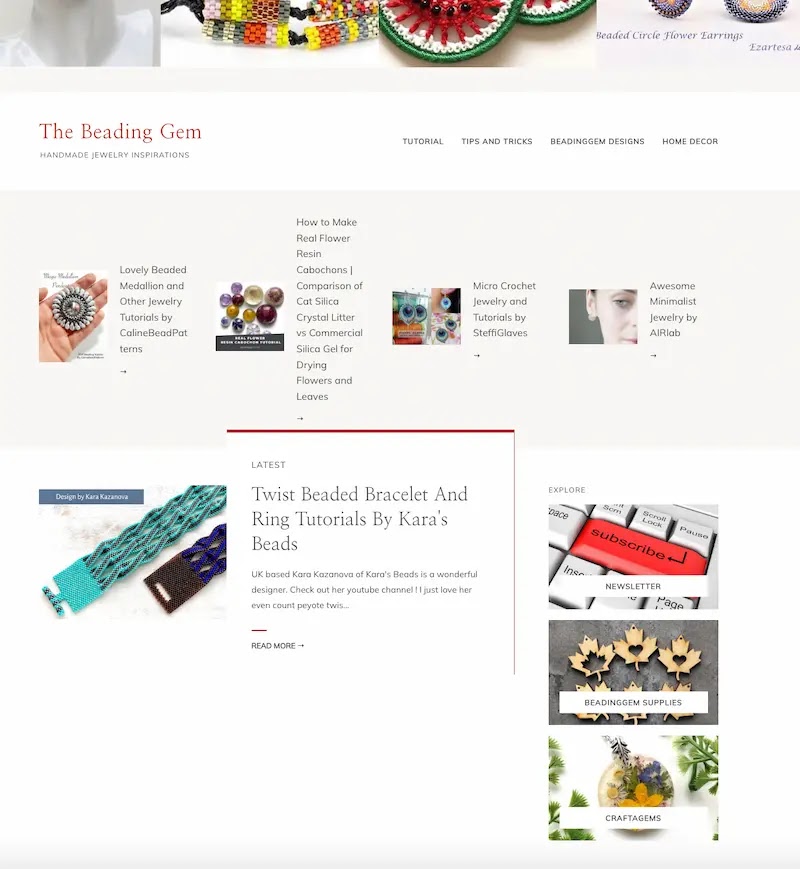
Right at the top is my Beading Gem Instagram feed which is updated all the time and clickable. Below that is the featured section where I will share top posts from the past. This set will be updated from time to time.
The desktop view is slightly different because there is more lateral space. Below the featured section is the latest post with my shop links to the right. There are also additional text links for tutorials, tips and tricks, my designs and home decor.
 |
| Desktop View |
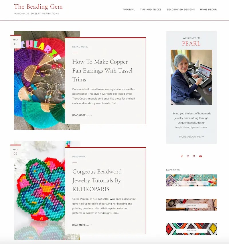
My sponsors appear next, followed by newer posts. On the right are Favorites which are technique categories. That will help you navigate to the techniques which interest you most!
Updating blog themes happens every few years as things change and that includes author images too! I have greyed considerably in the 17 + years I have been blogging!
Do explore. Some placements have changed. For example, the home and search bar is in a different place. Let me know what you think in the comments!
 |
| Desktop View |
This blog may contain affiliate links. I do receive a small fee for any products purchased through affiliate links. This goes towards the support of this blog and to provide resource information to readers. The opinions expressed are solely my own. They would be the same whether or not I receive any compensation.
______________________________
Original Post by THE BEADING GEM
Pearl, it looks great and that is a lovely photo of you.
ReplyDeleteThank you! The design not perfect yet but I am working on it.
DeleteNice layout! Certainly took me by surprise! :D
ReplyDeleteLooks neat and bright!
ReplyDeletewow! lots of white space! I'm slow to accept change, but I love how all the links are easy to find. we are all a work-in-progress, huh?
ReplyDeleteLove this new format, it is easy to navigate and looks great!
ReplyDeleteThe new design is great and looks very clean. But the body font is small and hence difficult to read on a desktop. You might want your designer to take a look at the footer in the desktop format. It happens when you design for a mobile first website.
ReplyDeleteOn it already regarding post font size! Still tweaking this design and that is the next thing to do. Not sure I want to do much about the footer. 2/3 of readers now read my blog with mobile devices. I don't have much need to put anything else there.
Delete